
By John Campopiano
Color plays such a vital role in our everyday lives – even if we’re not always aware of it. Color also plays a significant role in how we think about and understand history. Surely we’re all familiar with black and white photographs (&/or film) and most likely have a similar kind of knee-jerk reaction when seeing something in black and white: It’s old. But perhaps we overlook the reality that the past, no matter how far back our minds dare to dream, was full of color just as our current reality is. So, what kinds of feelings or ideas come to mind when we think about someone exercising their artistic skill to bring color – and with it life – to images of the past? We strove to explore these very questions and others with Boston-based colorist and trained archivist, Dana Keller.

John Campopiano: When did you first start coloring historical photographs?
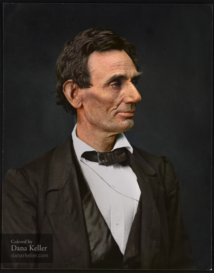
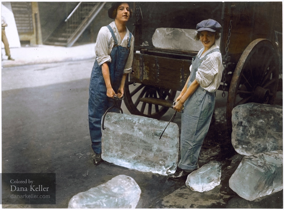
Dana Keller: I have been colorizing photographs for a little over 2 years. My interest in it began when I had seen a collection of colorized photos online that was receiving a lot of attention for being very realistic. To me, these images, while indeed very carefully and thoughtfully colorized, did not really look true-to-life, but rather more like paintings. They no longer resembled photographs. I had seen many colorizations before, and they have always looked very stylized, or at least it was unmistakable that they had been colorized, as opposed to resembling an actual color photograph. Having a background in art and several years experience with photography, I began to colorize photos myself and attempted to concentrate more on the subtleties of realistic colors and shading, with the goal of eliminating as much as possible the viewer’s awareness of the fact that the photo was colorized, and to enable the viewer to see it from a new perspective, as if it were actually a color photograph.
JC: Could you discuss the creative liberties that are at play during the transformative process, namely, with regards to choosing colors to use in any given photograph?
DK: One of the more difficult aspects to colorizing is selecting the appropriate colors. No color information is available in the grey values, so in order to preserve as much authenticity as possible, researching colors is a must. But since it’s of course impossible to research everything, that can only take you so far. It then comes down to some educated guessing. Grey values hint at what the possible colors could be; mix that in with some context clues and historical knowledge, and you can then start to build a realistic portrayal of what the scene could have looked like to the photographer at that moment. The key word there is could. There will always be a significant margin for inaccuracy and some “artistic license”.
Another heavy difficulty comes from poor quality images. Of course most of these historical photographs are over a hundred years old and are often faded and worn, they contain very little grey values, which are essential in order to realistically apply color. Aside from the significant age factor, black and white photographs are largely taken with different aspects in mind than with color photographs, mainly exposing for contrast rather than uniform detail. Very often, a black and white image will be taken with too much contrast or with too much exposure to allow for a color version that will be suitable, so some image editing has to be done to attempt to bring out details if at all possible. Often times image details are simply irrecoverable, rendering the photos unfit for colorization.
JC: I’m curious to hear a little about how you view a newly colorized work in relation to its original, non-colorized version. For you, what (if any) sort of relationship(s) exist?
DK: With black and white photos, we tend to feel somewhat distant and disconnected from the real and vibrant world those photos are actually portraying. And why shouldn’t we? The world was never in black and white, and it’s not something we are used to seeing in our day to day reality. By introducing color, these images can suddenly seem more familiar, and we are hopefully brought a little closer to the reality in which they were taken. Colorized photos can provide an opportunity for us to see a moment in history with a different perspective, a chance to connect with an increasingly distant but still very real and relevant past.

However, even though colorized photographs may potentially portray a more realistic view of the world (i.e., not black and white), they should of course not be viewed as replacements or enhancements on the original black and white images, nor should they be meant to assume any resemblance of authority as a historical artifact. They are meant to give the viewer an opportunity to see an image from history with a fresh pair of eyes, not to change an original record.
JC: Do you prefer to have a point of reference when colorizing a photograph (i.e., having a first-hand account of how something might have looked) or would you rather have full creative license?
DK: When attempting to be as historically accurate as possible, any reference material or knowledge that will assist in that is always preferred over having to come up with the colors from educated guessing. Not only does it save time in trial and error, but it’s always nice to have a solid reference for a color, especially when the grey value that it corresponds to isn’t one that I would have necessarily expected. By having one reference color, it can help to determine the lighting of the scene, and consequently help me in choosing other colors more accurately.
JC: Could you talk about your training as an archivist and if/how this training might conflict with some of the colorizing work you’re doing?
DK: Having been trained as an archivist, the fact that I am involved in and heavily advocate for colorization is an interesting controversy. As someone with a degree in archival science, it’s essentially part of my responsibility and nature to want to conserve historical documents/photographs as they are, and to preserve them for future generations. Several archivists and a great many others who have a passion for history see colorization as perhaps a misrepresentation of history or even a deliberate defacing or violation of the original records. I can certainly understand and appreciate their perspective from all angles.
My perspective, and what I believe to be the position of most colorizers, is that colorization is done out of a respect and reverence for history, not as a means of improving upon it. I see it as a very powerful tool–an opportunity to experience a closer connection to history and to offer that perspective to others who may want to experience it as well. And we’re free to take it or leave it. I want to reiterate that colorized photographs are not by any means meant to stand in for the originals or supersede their authority as historical records. For those who may not necessarily appreciate colorization, the good news is, no original photographs of history were harmed, destroyed, violated, overwritten, or disturbed at all whatsoever in the creation of these images. They are all still here for us all to see and enjoy and preserve for the future. And that’s part of the beauty of it, I think.
JC: Two parts:
Could you talk about an instance in which you received push back for your colorizing work? What were the circumstances surrounding the incident?
DK: When I first started colorizing, I shared some of my work with a few archivists, seeking their opinion on whether there was a place for colorization in the archives. Understandably, the idea was met with some backlash. This came mostly from senior archivists, their standpoint being that colorization, by its very nature, was completely contradictory to the mission of the archives, i.e., to preserve historical documents with minimal influence from the archivist. While in theory I agreed, I was still not convinced that there wasn’t a use for it within the archive world.
JC: Could you talk about a positive experience that stands out from your colorizing work?
DK: In my experience, the overall response to colorization has been very positive. The majority of people tend to see the photographs in a new way when they are colorized, and they express that it does indeed help them to appreciate the events and figures of the past as more relevant.
JC: Do you feel there is a place for the artist within the archives? Please explain.
DK: Absolutely. Art and design already play an important role through the curation of archival collections with how materials are represented and how they engage the public. In the archives, colorization can be considered another facet of that presentation. As mentioned above, colorization can help “connect” people to history; it can bridge the gap from a distant event and make it feel as immediate and relevant as it was when the photo was taken. This effectiveness can be used to engage different communities and generate interest. For example, a historical society, which was in the process of converting an old train station into a museum, commissioned me to colorize a photo of the building. They felt that the colorized image would allow greater opportunity for people to connect and feel the relevance of this historic place in their community, and would thus help generate funding for the project. Of course, being a historical society, they wanted to be as accurate as possible in the coloring process. In order to achieve this, they were able to take color samples from the base layer of paint on the building, which had been painted over many times through the years. By providing the data for the colors, we were able to color the image with a great deal more accuracy. So in practice, if we can build up the image with as much existing knowledge of colors as possible, often times using the archives own resources, we can then perhaps begin to create, theoretically, a more accurate—albeit of course artificial—representation of history. This can be a strong publicity tool, used to help tell the story of the images, giving people a unique and different way to connect to photographic collections.
JC: Without giving too much of the magic away, can you talk a bit about the technical skills/components involved with colorizing photographs? (I.e., software, hardware, etc.)
DK: All of the colorizing is done digitally, but still done mostly by hand. I use Photoshop and a Wacom tablet to “paint” in the colors on multiple layers so that they blend together to hopefully create a realistic blend of color. Part of the trick to colorizing is keeping careful attention to light and shadows, quality of light, etc. Take an up-close look at an actual color photograph and you’ll immediately see that light interacts with the world in very complex ways, and nothing is just one solid color. Lighting will sometimes play tricks on you, too. Depending on the color temperature, (e.g. time of day, or sunlight vs. incandescent), something that you perceive as “red” may actually be blue or purple when taking a color sample. All of these variables are essential to keep in mind when striving for realism in colorization.
